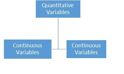
PROC CORR is used for performing Correlation Analysis and originates from the word Correlation. It focuses on the measure of the strength of the linear relationship between two continuous variables. Let’s recall that continuous variables are a subset of quantitative variables and that they store numerical data that is measured on a scale that has an infinite number of values containing no breaks such as 234, 234.6 and 235.0.
|
Dictionary tables contain vital information about your current SAS session. These special tables can only be used with PROC SQL whereas the views can be used with any SAS Procedures and Data Steps.
These special DICTIONARY Tables are automatically created each time they are referenced in a SAS program and store the following information about the current SAS session. · Libraries · SAS Macros · External Files · Tables · SAS System Options Settings · SAS Titles · SAS Footnotes · Columns · Views · Data Sets The INPUT statement is quite powerful and versatile. When creating SAS data sets from instream data or from raw data stored in external files, the INPUT statement should be used to describe how the raw data fields should be read and stored in the new SAS data set.
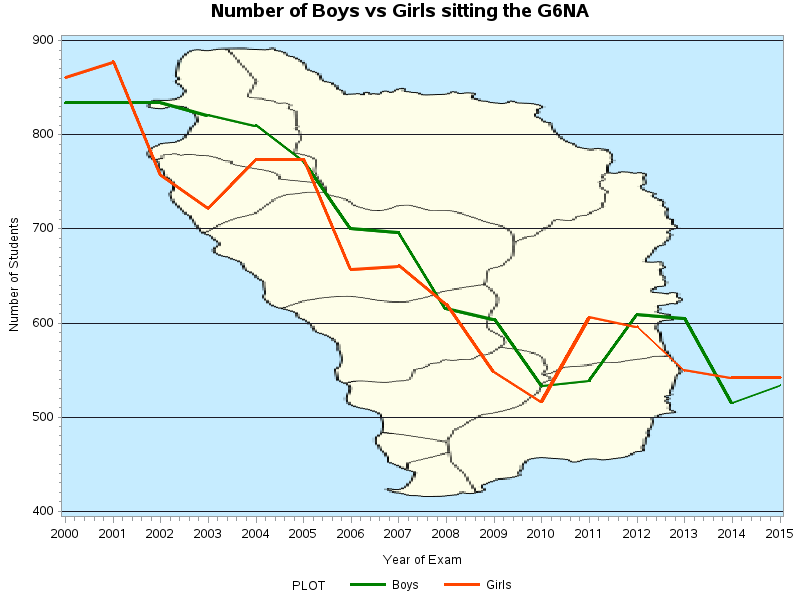
When creating SAS data sets from raw data stored in external files, using the INPUT statement with the INFILE statement is recommended. When using instream data to create SAS data sets, the INPUT statement should be used with the DATALINES, CARDS or LINES statements. In SAS, there are four types of INPUT STYLES that describe how raw data should be read. They are: 1. Column input 2. Formatted input 3. List input (simple and modified) 4. Named input The following Time Series Plots show the changes in the number of boys and girls sitting the Grade Six National Assessment (G6NA) in Dominica from 2000 to 2015. The graph shows a definite decrease in the number of students over the years.
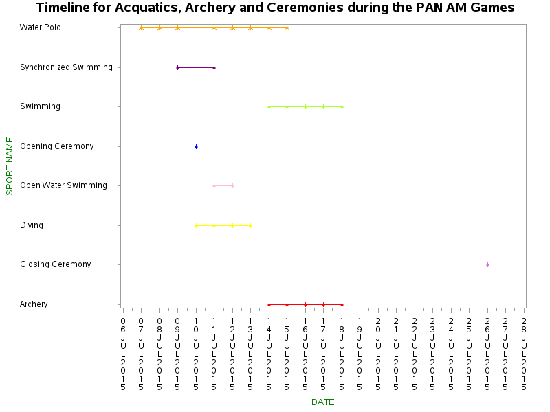
These graphs have been created using SAS Programs. The first graph has been kept simple. The green line represents the number of boys and the orange line represents the number of girls. The second graph is statistically identical to the first with the exception of the Map of Dominica in the background. Further Statistical Analysis can be done to investigate and explain this gradual decrease over the years of the number of students sitting the G6NA. These Time Series Graphs give a visual picture of the Time Line of all the Sports at the PAN AM Games. The vertical y-axis shows the Sport Names while the horizontal x-axis shows the dates which run from July 6th 2015 to July 28th 2015. These Time Series Graphs give a visual picture of the Time Line of all the Sports at the PAN AM Games. The vertical y-axis shows the Sport Names while the horizontal x-axis shows the dates which run from July 6th 2015 to July 28th 2015.
|
AuthorMy name is Vanessa Afolabi also known as @TheSASMom. I am a Data Scientist fluent in SAS, R, Python and SQL with a passion for Machine Learning and Research. ArchivesCategories |


 RSS Feed
